|
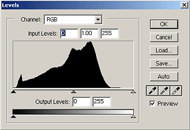
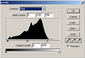
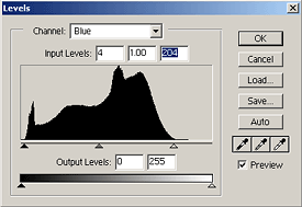
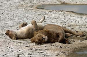
This article assumes a basic working knowledge of Adobe Photoshop. I've written this assuming version 6 of Photoshop. I will create a modified version for version 7 once I get a copy. All photographs copyright Jay Torborg. Bringing Images into Photoshop Matt Hagadorn has an excellent article on inputting images into Photoshop with correct color management. I recommend you read this article and follow its guidelines. Whether your image is coming from a scanner or digital camera, it's best to bring it into Photoshop as a high-bit image (greater than 8-bits per pixel) if your device allows it. Photoshop now allows many operations to be performed in 16-bit per primary mode which will reduce loss of tonal detail as you do your editing. If your input device supports color management and can save a file in a color space other than sRGB, I recommend that you use Adobe RGB. This is becoming a popular alternative color space for digital cameras and scanners because it preserves more dynamic range and shadow detail than sRGB. However, if you're working on an image to post to the web, you should use sRGB as your working color space. The most popular web browsers do not implement color management. The sRGB color space is designed to be close enough to most CRT and LCD monitors that it can be viewed without color management with good results. I generally keep all my high resolution images in Adobe RGB and convert to sRGB for web images. Digital Camera Settings If your camera supports a RAW image mode, you'll get the best results if you use this mode. This preserves all the data that is captured by the image sensor and gives you the most flexibility in editing the image once you're back from the field. I would also recommend setting the camera's sharpening controls to their lowest setting. It is better to do sharpening after you've adjusted the tonal balance because it's possible that your tonal changes will accentuate the sharpening artifacts. Adjusting Levels and White Balance The first step when you get an image into Photoshop is to adjust the black point and white point of the image. If you have a good scanning program, you may have been able to do this as part of the scanning process, but it still pays to take a look in Photoshop since you generally have more control in this application. Here's an image captured by the Nikon D1X before any processing. You'll notice that it has a fairly good histogram with no clipping of shadows or highlights, but the image looks a bit subdued with a slight bluish tint.
This is a case where we have a pretty good reference for colors. We know that the shadows in the cracks should be pretty close to black and the dried mud itself should be very light gray or even white. For images where all the colors are mid-tones, it is a little harder to adjust the black point and white point and must be done by eye. This is why it's very important to have a good calibrated monitor (see Matt Hagadorn's article on Color Management).
The eye droppers on the levels dialog allow you to select a black point, gray point, and white point from within the image. I generally don't find these terribly useful, but if you've got an image with truly black shadows or white highlights, then it is worth trying them. It's also worth trying the AUTO button, although I've found that this tends to clip the shadows and highlights a little much for my tastes. |